

Making Space for Impact Story Scales and Place-name Equity
- Ana Ranković
- Nov 5, 2025
- 5 min read
Welcome to the next installment of Making Space - a monthly memo for activists and changemakers about the ideas, tools, and stories that keep us moving, and how they might help you too.
In this issue, you’ll learn:
How choosing the right scale for your data, from personal stories to city-wide patterns, can transform how people see your impact.
How a simple map of street names is revealing gender and diversity gaps across Europe.
How funders and communities are using dashboards to drive local change — and how you can start one, too
Where and when to catch-us at SOMOS 2025 in Puerto Rico
Let’s get into it.
Olivia & Charles from North Arrow 🧭
Visualizing impact at different scales for different audiences
We live inside “nested” geographies: people within neighborhoods, neighborhoods within districts, districts within cities. The scale you choose to visualize your work changes what people see and how they understand it: micro makes the work human, meso makes it operational, macro makes it policy-relevant.
Scale choices shape patterns, and aggregating data differently can hide or create them, so matching scale to audience is the difference between clarity and confusion.
Let’s see how that looks in practice
Micro (at the person/site/single story level)
Use when: you need hearts and trust (individual donors, comms, press). Answer: Whose life changed? What did the journey look like? Why it works: people connect to other humans and their stories.
Visualisations you can use
Story pins or map tours: small maps with one person or place per stop, a photo, and a short caption.
Before/after slider: swipe to see change over time or impact.
Quote or short clip: embed a sentence or 10-second video from someone you’ve helped.
100-square grid: show proportions at a glance.

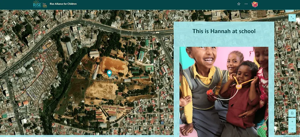
Phipps Neighborhoods: A story pin pairs a short family vignette with a precise map marker, grounding the human narrative in place.

Read to Grow: A clear waffle chart compares the state baseline with program families to show uplift in daily reading at a glance.

The Rise Alliance for Children 2025 Interactive Gala Presentation 2025 Interactive Gala Presentation showcases short videos that illustrate compelling individual stories in Ethiopia and Ukraine
Meso (at the program/neighborhood/district/county level)
Use when: you need to show need, coverage, gaps, and impact across zones/districts/neighborhoods.
Answer: Where are we active? What’s the mix and coverage? Where are the gaps?
Why it works: it proves execution and equity within a community, what’s covered vs under-served.
Visualisations you can use
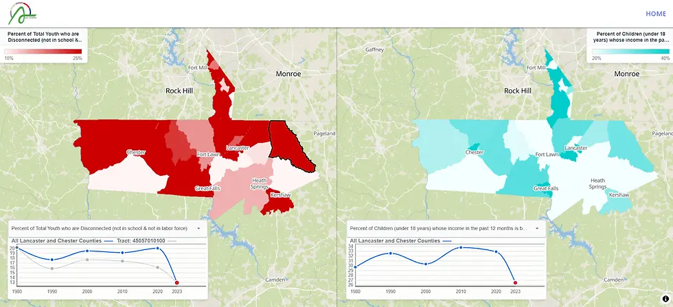
Shaded area maps (we call them chloropeth maps!): compare service rates across districts.
Bubble maps: show where activities are concentrated (e.g., participants served).
Two-color maps (bivariate, need x service): reveal areas with high need but low service.
Stacked bars: show growth or seasonal patterns over time.

The Chinese-American Planning Council’s Interactive Impact Tour overlays programme sites on a choropleth of households receiving food stamps, so you can see service clusters against areas of highest need, clicking a cluster reveals the specific programmes at that location.
The Arras Foundation Community Health Indicators Dashboards (in development) allows the user to compare outcomes side by side, as well as overtime.
Macro (at the city/region/statewide level)
Use when: you need to brief policymakers, advocacy leads, institutional funders, or media on system-wide patterns across an entire city, region, or state.
Answers: Where are systemic gaps? How are they changing? Which districts/agencies should act, and with what resources?
Visualisations you can use
Goal-anchored maps: City/region map with a diverging color ramp tied to a target (e.g., ≤10% cost-burden). Shows who’s above/below goal at a glance.
Need vs. service maps: highlight where action is most urgent.
Side-by-side maps: show how things have changed over the years or how things compare between two different outcomes
Legislative context layer: Overlay Council/Senate/Assembly districts; enable click-to-see reps and counts to convert findings into outreach.
Simple KPI bars: track progress toward key goals. Typically pairs well with the choropleth.
Program Footprint vs Population: Proportional symbols for your sites or people served atop the macro map to show reach at scale.

The Chinese-American Planning Council Community Map allows users to select distinct legislative districts to see program and community data aggregated.

The United for Brownsville Dashboard shows community health outcomes aggregated at the neighborhood level but compared to city-wide and borough benchmarks. Users can also select neighborhoods to further the comparison
At each scale, the question isn’t “How do we tell our impact?”, it’s “How do we show it so the right people can act?”
Mixing Micro, Meso and Macro subtly and in a compelling sequence might be the best recipe for a powerful story of impact!
For their annual gala interactive presentation, we worked with RISE to weave individual stories within a higher level showcase of global reach and impact. It was a hit!


How are you currently showing impact? Hit reply with a link or screenshot, and let’s see if we can help you improve.
🔦 Mapping Activist Spotlight: Mapping Diversity
We recently stumbled upon this awesome project mapping gender equity and diversity in Europe’s main cities, through the simple prism of place and street names.

The lack of female representation shouldn’t come as a shock, but the value lies in the variance between cities, and how some are trying to fix it. The most equal city studied is Madrid, with 32.5% public places names dedicated to women, while other capitals like Vienna and Oslo clock-in at a shameful 0%.
The team behind Mapping Diversity, OBCT, is a think tank and a media specialised on South-East Europe, Turkey, Eastern Europe and the Caucasus and on the EU policies in the fields of media freedom, civil society, the enlargement and cohesion
🦄 Awesome Nonprofit of the Month:
We’re thrilled to be supporting Finding Common Purpose, a funder collaborative backing place-based initiatives. They recently published an extensive benchmark studying the state of community dashboards in the US, referencing and comparing hundreds of examples of local community data projects.

Amongst many projects, we’ve worked with them to design a Starter Community Dashboard service to lower the barrier for community organizations that want to turn local data into action.
If you’re exploring a first dashboard for your community, contact us to get more info!
🗞️ North Arrow Bulletin - Catch-us @ SOMOS !

We're heading to SOMOS, the biggest NYC impact conference, hosted every year in Puerto Rico, with hundreds of nonprofit leaders and legislators.
We will be running a panel on Community-led Data Ownership, alongside our historical partners of the Chinese American Planning Council, Partnership with Children and Phipps Neighborhoods.
Pin your agendas for Thursday, November 6th, from 1:45pm - 3:00pm in Flamingo B (2nd Floor) 🦩
💬 If this sparked something, an idea, a question, or a project you’ve been meaning to start, we’d love to hear about it.
Until next time,
The North Arrow team


Comments