

Making Space for Impact Dashboards and Data Resistance
- Charles Grosperrin

- Jun 30, 2025
- 4 min read
Updated: Sep 4, 2025
Welcome to the next installment of Making Space - a monthly memo for activists and changemakers about the ideas, tools, and stories that keep us moving, and how they might help you too.
Let’s talk about impact dashboards - in this issue, you’ll learn:
The ingredients to creating a game-changing dashboard for your nonprofit
How a nationwide dashboard is helping communities track health outcomes
How the Chinese-American Planning Council is supporting NYC’s AAPI community from tinkle to wrinkle
Let’s get into it.
Olivia & Charles from North Arrow
The Anatomy of a Great Impact Dashboard
A well-designed dashboard should look good, but way more importantly, it should also help your team make better decisions, communicate value, and track change over time.
But what does that actually take? Here are the pillars of a great nonprofit dashboard.
📌 We recognize that these ingredients deserve way more than just a few lines! Stay tuned and we’ll dedicate future issues to Making Space to each.
The 5-Part Impact Storytelling Blueprint
And now our partners have used it
Program Data
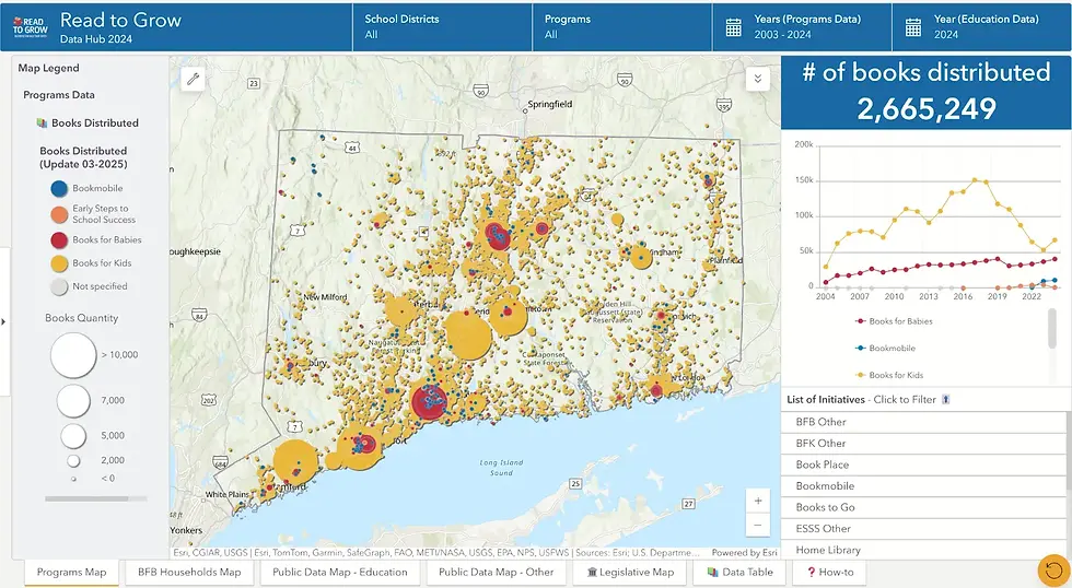
At the heart of every dashboard are the metrics that quantify your program's work over time and geographically. This means having a solid data collection process that ties outcomes to specific places (more on this in an upcoming newsletter!).
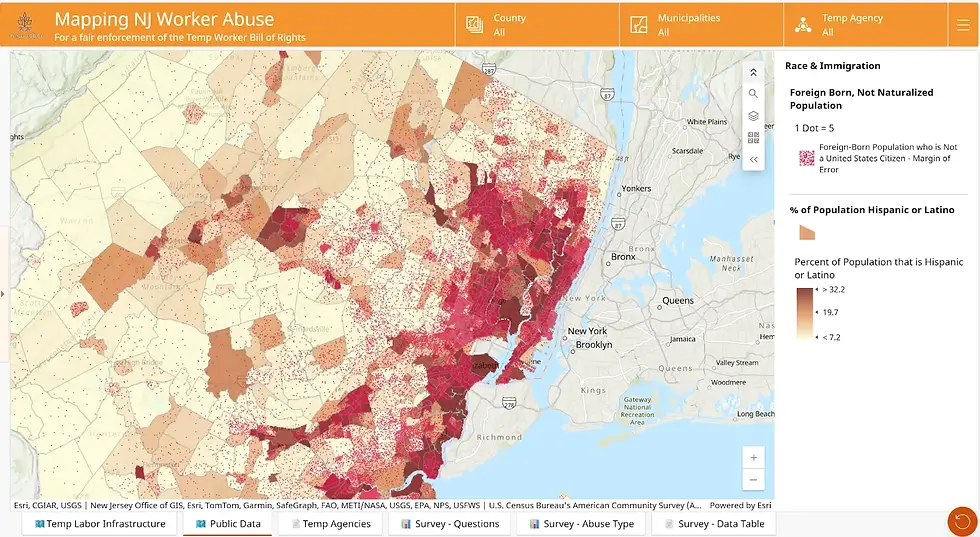
Curated Public Data
Despite recent threats to open data, the US remains one of the most data-rich countries in the world. Between the American Community Survey and countless state and federal resources, there’s an overwhelming amount of public data available. The key is to curate what aligns with your mission and track it over time to reveal trends and insights.
Administrative Boundaries
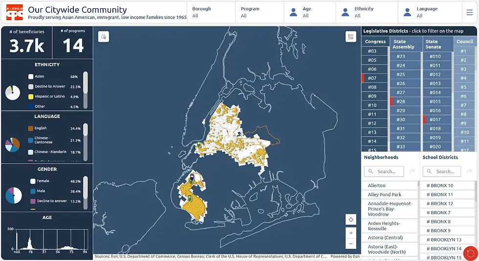
To advance advocacy, nonprofits have to talk to elected officials about their work in their respective districts. A great dashboard offers legislative district filters, allowing nonprofits to easily see their work in relation to dozens of legal and political jurisdictions.
Smart Filters (Space & Time)
Your data is only valuable if it can be queried and analysed through different lenses. "Smart filters" allow for easy ways to see and track progress over time. We recommend a combination of geographic filters and longitudinal datasets. If you're an education advocacy nonprofit, this can be school district geographies combined with school performance data from the past few years.

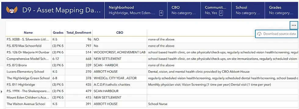
Exportable Tables
We strongly recommend adding ways to download your dashboard data to be able to analyze it further offline and to share it with your teams and communities. We like to add simple tables that are tied to our dashboard filters and can be extracted as good ol’fashionned Excel files.
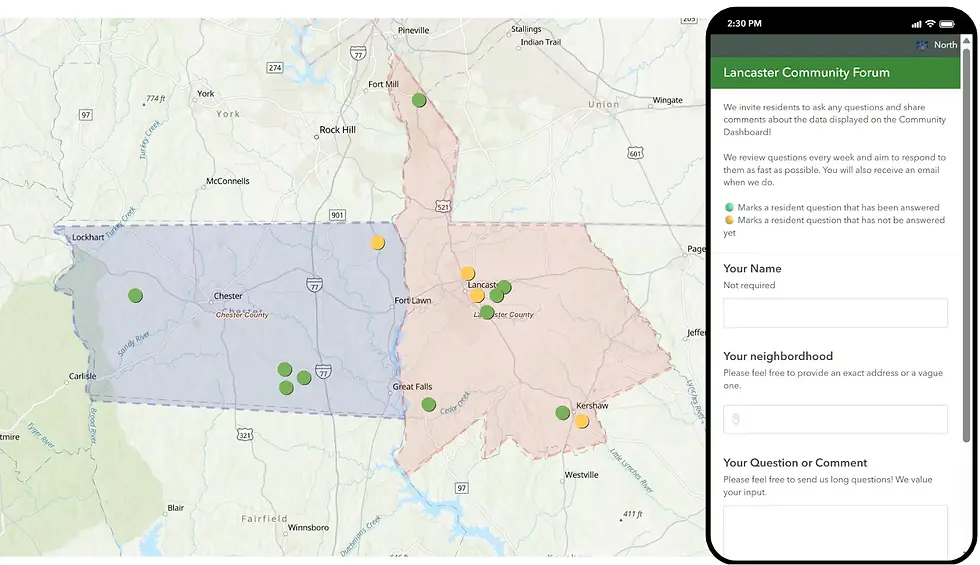
Community Engagement Features
Especially if your dashboard is public-facing!
Allow your beneficiaries to engage with what they see and ask questions, and answer them publicly. Your dashboard becomes a forum where the community can meet and grow.
You don’t need to start from scratch or invest in expensive platforms to build a useful dashboard. Tools like ESRI’s ArcGIS Dashboards, Tableau, and Power BI offer powerful capabilities for nonprofits, especially when paired with the elements we discussed.
What matters most is clarity: does your dashboard help people understand your work, make decisions, and take action? If the answer is yes, then you're well on your way.
🔦 Activist Spotlight: A Nationwide Health Tracker for Communities
As we are currently on a journey to design a scalable dashboarding solution for community-based organizations, we take inspiration from a couple of powerful nationwide tools that empower place-based initiatives with the data they need to make educated decisions.
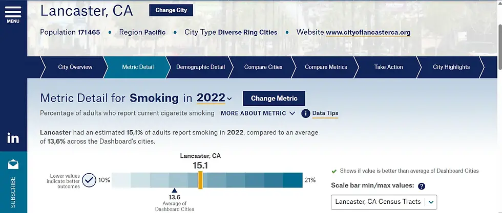
One standout example is City Health Dashboard designed by NYU Langone Health. Thanks to a beautiful interface, organizers and officials can visualize and compare 43 health-focused indicators, including health outcomes, social and economic factors, health behaviors, but also physical environment metrics.
Awesome Nonprofit of the Month: The Chinese-American Planning Council

CPC stands as the nation’s largest Asian American social services organization, offering a powerful network of support at every life chapter: from early childhood education to youth development, career training, senior services, and everything in between!
💬 If this sparked something, an idea, a question, or a project you’ve been meaning to start, we’d love to hear about it.
Just hit reply and let’s chat.
Until next time,
The North Arrow team


Comments