

Our favorite climate maps of 2023
- Charles Grosperrin
- Jan 15, 2024
- 7 min read
Updated: Mar 23, 2024
Maps have never been more critical in the climate change fight
On each day of last month's COP28 in Dubai, North Arrow published a climate related mapping project. We selected them not only for their ambition, their impact, their complexity, but also for the people that built them. Each of these projects inspire us as individuals to act, and as a company to keep working hard to gather enough momentum, resources and talent to work on projects of this magnitude.
Behind these maps are not only cartographers. There are large teams of passionate engineers, designers, data-scientists, advocates and activists from the four corners of the world. It takes a lot of resources, skill and drive to build tools that can be used by tens of thousands of people, to maintain them overtime, to make sure that their existence is known.
Among the many teams out there, the Earth Genome stands out.
I am a huge fan of their work, and they blow me away with each and every new project that comes out of their map lab. Backed by some of the largest climate focused foundations out there, the Earth Genome regularly publishes groundbreaking research and tools that have consistently made headlines around the world. Their mission in their own words: “to build novel technologies that combine environmental data, earth science, and relevant financial information into actionable environmental intelligence - for a more productive and sustainable planet where all people, economies and the environment thrive together.” For all of these good reasons, The Earth Genome is heavily featured in the list, where I’ve also tried to showcase the work of lesser established climate - and climate justice - activists. Enjoy!
1 - WasteMap by the Earth Genome & RMI
Methane is the annoying little brother of greenhouse gasses, and accounts for 16% of global emissions. But it is about 28 times as potent as carbon dioxide at trapping heat in the atmosphere.
Not only is this map a great directory of hazardous sites, but it also offers a tool to model the effectiveness of different waste diversion scenarios. A great asset to be released ahead of #cop28 talks. I had the pleasure to chat with Mikel Marron, Product Lead at the Earth Genome, who also has a long experience working at Mapbox and sits on the Board of the OpenStreetMap foundation (talk about a mapping pedigree!). Mikel explained to me that WasteMap aggregates data from a wide array of available sources– self reported government or industry numbers, citizen monitoring, and modeled emissions. However, there are still waste sites that are unreported. In order to include those the Earth Genome has created a machine-learning analysis of satellite imagery. The invaluable data can be used in endless use cases, and has already proven incredibly impactful. The Earth Index (the name used by the team to describe this new AI-generated intelligence) is already powering the best tool for monitoring ecocidal and illegal gold mining practices in the Amazonian rainforest.
🗺️ The cartographer’s corner: we love how interacting with the main map triggers a right panel with supporting graphs and data points, and how an index ranks countries against each other. Easy access to data download features and methodological documentation accentuate the aim of the tool: resources for research and advocacy.


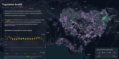
2 - Climate & Conflict by the German Federal Foreign Office
Climate change will increase the prevalence of armed conflicts in many already unstable areas of the globe. This is going to be one of its deadliest consequences. People killing others in existential fights for resources.
The Climate & Conflict map builds an index to identify regional hotspots where climate related violence is likely to grow over the coming decades. The index takes into account climate factors, socio-economic scope conditions and pre-existing/ongoing conflicts.
🗺️ The cartographer’s corner: Don't miss the case study on Nigeria and its sub-Saharan neighbors, a masterclass of data-driven storytelling. The seamless side-car transition between regional maps and local focus points is extremely effective in giving the reader a sense of the different scales at which climate change is already affecting local populations.


3 - Heartbeat of The Homelands Climate Justice by The Indigenous Peoples Power Project
The Indigenous Peoples Power Project (I3P) provides nonviolent direct action training, campaign strategy and community organizing tools to support Indigenous communities taking action in defense of their homelands. They built this ongoing mapping project, where are listed environmental justice issues affecting Indigenous communities through the United States, with a wealth of resources including interviews, videos, and calls to action.
The term “climate justice” has emerged to explain how those who are least responsible for climate change – the most vulnerable, disadvantaged and marginalized – tend to suffer its gravest impacts.
In the global fight against climate change, it is key to remember that Indigenous peoples are responsible for protecting an estimated 22% of the planet’s surface and 80% of biodiversity (source: International Work Group for Indigenous Affairs (IWGIA) 2021)
The role played by Indigenous groups, in particular women, in environmental protection has been widely recognized.
“Indigenous women carry the knowledge of their ancestors while also leading their communities into a resilient future. When Indigenous women engage, climate policies and actions at every level benefit from their holistic, nature-focused knowledge and leadership.” Patricia Espinosa - UN Secretary
🗺️ The cartographer's corner: this isn’t a complex mapping project in any way, and a lot more could be done to fully flesh out the project on the ground and the areas they affect. But the map does a great job at providing multimedia (videos, photos, testimonials) that give life to the tribes affected and meaning to their fight.


4 - Land Cover Explorer by ESRI & Microsoft
Time to get geeky! ESRI partnered with ImpactObservatory and Microsoft to produce a gem of a layer that displays a global map of land use/land cover derived from satellite imagery at 10-meter resolution. Each year, a new layer is generated with Impact Observatory’s deep learning AI land classification model, trained using billions of human-labeled image pixels from the National Geographic Society.
In this particular extent of a slider map, one can easily witness the dramatic retreat of the Columbia Glacier in Alaska, between 2017 & 2022. Maps and satellite imagery are essential to witness and understand the shifts triggered by global warming, and bring objective and irrefutable proof that our ecosystems are spiraling out of control.
🗺️ The cartographer’s corner: who doesn’t love a map slider to show change overtime? We certainly do.

After only 1-year of his return to power, Lula announced a 22% decrease in deforestation in the Amazon. This announcement was quickly followed by warnings from local advocacy groups saying that the great forest was still in great danger.
It's no news that forests are at the heart of the problem, as well as the solution. Land use change, principally deforestation, contributes 12–20% of global greenhouse gas emissions. And 80% of deforestation is driven by agricultural expansion, in large parts to feed the exploding cattle industry.
Global Forest Watch (GFW) built a comprehensive map of forest coverage around the globes and tracks their evolution. More than a map, it is an online platform that provides data and tools for monitoring forests, and is used by thousands to stop illegal deforestation and fires, call out unsustainable activities, defend land and resources, sustainably source commodities, and conduct research at the forefront of conservation.
🗺️The cartographer’s corner: the ability to overlay the general change in tree cover dot layer with land use types polygon layers (including logging, mining, palm oil concessions) makes it extremely difficult for the industries to hide the nefarious impact of their activities. And easier for activists and advocates to go after them.


MEJ is an ongoing map project led by a small team that started at UC Berkeley studying the intersection of socio-economic, racial and environmental inequities. Unsurprisingly, historically disadvantaged communities are the most impacted. Lack of green infrastructure investment, proximity to hazardous and toxic waste or energy producing sites, poor housing conditions and access to health are some among many factors that put these communities on the frontlines of change. I had the pleasure of speaking with Adam Buchholz, who leads the initiative and has already built two beautiful maps for Colorado and Virginia. When we talked about his theory of change, Adam told me that there's no greater achievement for a map than to have positively influenced local regulations. In 2021, the Colorado Legislature passed the Environmental Justice Act while explicitly citing Adam and his team's work. Talk about impact! 🗺️The cartographer’s corner: Adam and his team are faced with the difficult task of aggregating a large range of different indicators. They get the job done with a seemingly simple but methodologically complex solution of an index, mapped with a choropleth layer. And it works!


7 - TRACE Climate by the Earth Genome
The most ambitious attempt at mapping granular carbon emission sources. With more than 450.000 sources aggregated and visualized, this map lifts the curtain on the often opaque world of carbon culprits. A search bar allows the user to enter company names to show all their investments (I dare you to try TotalEnergies), and selectors allow the filtering by gas type.
Unveiled by climate champion Al Gore at the COP28 in Dubai, this tool is a massive step forward toward more transparency for big emitters that will find it harder and harder to hide their ecocidal practices.
🗺️The cartographer’s corner: despite the complexity of the mapping task at hand, the team has done an exceptional job at leveraging many different symbologies to represent different types of emissions at different scales! At the world-scale, every source shows as in what feels like a single point layer, but as you zoom in, transportation sources morph into polygons to cover urban areas, dot or pixel grids represent emissions for different land uses. A stunner!


Have other cool climate maps that we may not know about?
Drop them in the comments below!
Have a climate mapping project in mind but need guidance?
Reach out at charles@north-arrow.org